Advanced Data Plotting in MATLAB
Plots and Visual representation of the data is a core strength of MATLAB, offering extensive tools to display, analyze, and interpret data visually. This section covers the advanced Plotting techniques.
Scatter Plots
% Creating a scatter plot

x = randn(1, 100);

y = randn(1, 100);

scatter(x, y, 'filled'); % Create scatter plot with filled markers

title('Scatter Plot Example');

xlabel('x-axis');

ylabel('y-axis');

grid on;

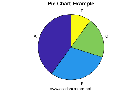
Pie Charts
% Creating a pie chart

data = [40, 30, 20, 10];

labels = {'A', 'B', 'C', 'D'};

pie(data, labels);

title('Pie Chart Example');
Interactive Plot Using plot
The plot function can be made interactive using datacursormode:
% Interactive Line Plot

x = 0:0.1:10;

y = sin(x);

plot(x, y, '-o');             % Plot with markers

title('Interactive Sine Plot');

xlabel('x-axis');

ylabel('y-axis');

grid on;                      % Enable grid

datacursormode on;            % Enable data cursor for interaction

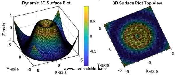
Dynamic 3D Rotatable Plot
Users can rotate 3D plots dynamically with the mouse using the rotate3d function:
% Dynamic 3D Plot

[X, Y] = meshgrid(-5:0.1:5, -5:0.1:5);

Z = sin(sqrt(X.^2 + Y.^2));

surf(X, Y, Z);              % 3D surface plot

title('Dynamic 3D Surface Plot');

xlabel('X-axis');

ylabel('Y-axis');

zlabel('Z-axis');

colorbar;                   % Add color scale

rotate3d on;                % Enable interactive rotation
Advanced Visualization Examples in Matlab
Heatmaps
Heatmaps are useful for visualizing data matrices:
% Creating a Heatmap

data = rand(10, 10);       % Generate random data

heatmap(data);             % Create heatmap

title('Heatmap Example');  % Add title

Bubble Charts
Bubble charts allow visualization of three variables in 2D space:
% Creating a Bubble Chart

x = rand(1, 50);           % X-coordinates

y = rand(1, 50);           % Y-coordinates

sizes = 100 * rand(1, 50); % Bubble sizes

bubblechart(x, y, sizes);  % Generate bubble chart

title('Bubble Chart Example');

xlabel('x-axis');

ylabel('y-axis');

Geographical Plots
MATLAB supports geographic visualizations:
% Creating a Geographical Plot

lat = [37.7749, 34.0522, 40.7128];      % Latitude of cities

lon = [-122.4194, -118.2437, -74.0060]; % Longitude of cities

names = {'San Francisco', 'Los Angeles', 'New York'};

geobasemap('streets');                  % Set map style

geoplot(lat, lon, '-o', 'LineWidth', 2); % Plot on map

text(lat, lon, names, 'VerticalAlignment', 'bottom'); % Add labels

title('Geographical Plot Example');

Animations
Animations make data presentations more dynamic and intuitive:
% Creating an Animation

x = 0:0.1:10;

y = sin(x);

figure;                       % Create a figure window

h = plot(x(1), y(1), '-o');   % Initialize plot

xlim([0, 10]);                % Set x-axis limits

ylim([-1, 1]);                % Set y-axis limits

title('Sine Wave Animation');

xlabel('x-axis');

ylabel('y-axis');


for i = 2:length(x)

    set(h, 'XData', x(1:i), 'YData', y(1:i)); % Update plot

    pause(0.1);               % Pause for smooth animation

end
Useful MATLAB Functions for Advanced Visualization
Practice Questions
Test Yourself
1. Generate a 3D plot for Z = cos(X^2 + Y^2).
2. Visualize a data matrix using a heatmap and interpret the results.
3. Generate an animation for a cosine wave.
4. Plot a geographical map of three cities with labeled coordinates.